


The short answer
Screens show colour in RGB (light). Most printing builds colour from four inks, CMYK (cyan, magenta, yellow and black). Pantone colours are specific, pre-mixed ink colours identified by a number. For full-colour designs, set your artwork up in CMYK. If your brand colour matters, give us its Pantone reference: we offer Pantone matching with screen printing, as a target on your chosen board and finish rather than an identical match on every material. The board colour changes how ink looks, and a digital proof checks layout, not final physical colour.
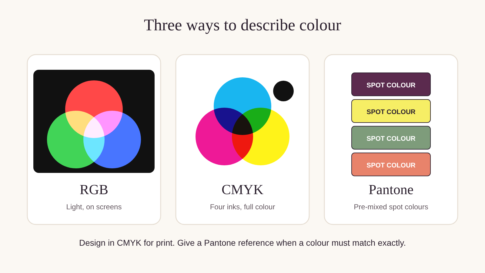
The three colour systems
RGB: colours on a screen
Screens mix red, green and blue light. RGB can show very bright, glowing colours that ink on board can't reproduce. If you design in RGB, colours may look duller once printed.
CMYK: process printing
CMYK printing builds every colour from tiny dots of cyan, magenta, yellow and black ink. It's used for full-colour images and is how digital and offset printing reproduce photos and illustrations.
Pantone: spot colours
A Pantone colour is a specific ink, mixed to a recipe and identified by a number. Because it's mixed rather than built from dots, it gives a solid, consistent colour. We print to Pantone references with screen printing.
Which to use
| Your artwork | Set it up as | Why |
|---|---|---|
| Photos, illustrations, gradients | CMYK | Process printing reproduces full-colour images |
| Logo in one or two brand colours that matter | Pantone reference | Mixed ink gives a consistent solid colour on your chosen board |
| Simple logo, close enough is fine | CMYK, with your colour values | Practical for digital and offset runs |
| Anything designed on screen | Convert to CMYK and check the proof for layout | Screen colours can look brighter than print |
Why colours look different on different boards
Ink sits on top of the board, and many inks are slightly see-through. On white board, colours print brightest and closest to what you see on screen. On kraft brown board, colours print darker and warmer, and pale colours can almost disappear. Black kraft boxes are screen printed, which uses opaque inks, including white.
Paperboard with gloss lamination makes colours look richer and deeper. Matt lamination makes them look softer.
What it means for you
The same question, answered for where your business is today.
Choose your stage at the top of the page to open the advice for you.
Start-up · under 100 units
Save your logo in CMYK and as a vector file, and note your brand colours as CMYK values. That's enough for most first print runs.
Expect colours on kraft to print darker than on screen.
Growing · 100 to 2,499 units
If your brand colour matters, find its Pantone reference and include it with your artwork. Keep one set of colour references for every supplier and product.
Try this: keep a printed box from each run as your colour reference for the next.
Enterprise · 2,500 units and more
Put Pantone and CMYK references in your packaging specification, along with the board and finish, so every reorder can be checked against them.
Colour can vary slightly between boards, methods and runs. Specify what's acceptable.
Common mistakes
- 1Sending RGB files. Bright screen colours can look duller once printed. Convert to CMYK and check the proof.
- 2Expecting the same colour on kraft and white. The board colour changes the result. Choose colours that suit your board.
- 3No colour reference. "Our purple" means different things to different people. Give a Pantone or CMYK reference.
- 4Judging colour on a phone. Screens vary. Use a printed reference where colour matters.
Colour questions
What's the difference between CMYK and Pantone?
Do you match Pantone colours?
Should my artwork be RGB or CMYK?
Why does my colour look different on kraft?
How do I know what my printed colours will look like?
Keep reading
Printed packaging

Worried about getting your colour right?
Send us your artwork and colour references. Our Melbourne team will advise on the best print method and send a digital proof, typically within 1 business day of receiving your artwork.