


Guide / Printing / Chapter 4.11
Printing on kraft board and white ink.
Kraft brown packaging has a natural, honest look that many brands love. Here's how print behaves on kraft, which colours work, and when white ink or white board is the better choice.
The short answer
Kraft board is brown, so ink printed on it looks darker and warmer than on white board, and pale colours can almost disappear. Bold, dark colours and simple logos look best. We digitally print kraft brown die-cut boxes from 25 units. For a white logo on kraft or on black boxes, screen printing with white ink is the answer, from 250 units. If your design relies on bright or pale colours, consider white board instead.
Why kraft changes your colours
Most printing inks are slightly see-through, so the board colour shows through the ink. On white board, you see the true ink colour. On kraft brown, every colour mixes with the brown underneath.
- Black and dark colours stay strong and look great.
- Reds, greens and blues print darker and more muted.
- Pastels, yellows and light greys can fade into the board.
- White isn't printed by our digital (CMYK) service, so any white areas in your artwork simply show the brown board. For white, you need opaque white ink, which we print with screen printing.
What to expect on each board
| Board | Colours | Best for | How we print it |
|---|---|---|---|
| Kraft brown | Darker, warmer, muted | Bold logos, natural brands | Digital from 25 units, or screen with white ink from 250 |
| White | Bright and accurate | Full colour, brighter colours, pastels | Digital from 25 units, or screen from 250 |
| Black kraft | Needs opaque ink | White or coloured logos | Screen printing from 250 units |
Making kraft look great
Design for the board
Choose a palette that suits brown: black, deep navy, forest green, burgundy or a strong terracotta. Avoid relying on pale colours for important details.
Use the board as a colour
Kraft can be part of the design. A one-colour logo with plenty of bare kraft around it often looks more premium than a busy full-colour print.
Add white for contrast
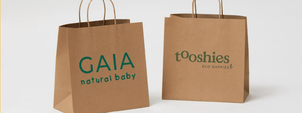
A white logo on kraft stands out beautifully. We screen print white ink on kraft brown boxes from 250 units. It isn't priced online, so ask us for a quote.
Check the proof
Your digital proof shows the layout on the box, not the final physical colour. Look at it with kraft in mind, and if colour is critical, ask about colour swatches or a printed sample.
What it means for you
The same question, answered for where your business is today.
Choose your stage at the top of the page to open the advice for you.
Start-up · under 100 units
A black or dark logo on a kraft mailer box, digitally printed from 25 units, is one of the simplest and most effective ways to brand your packaging.
If your logo is pale, ask us about a darker version for kraft.
Growing · 100 to 2,499 units
If your brand uses bright or pastel colours, compare kraft and white boards before a larger run. White board may show your colours better.
Try this: order your logo in black on kraft and in colour on white, and see which suits your brand.
Enterprise · 2,500 units and more
Specify the board colour along with the ink colours in your packaging specification. The same artwork can look quite different on kraft and white.
For white logos on kraft or black, plan for screen printing from 250 units.
Common mistakes
- 1Pale colours on kraft. Light colours can disappear. Choose stronger colours or white board.
- 2Expecting white areas to print white. Our digital print doesn't use white ink, so white areas show the brown board. Use screen printing with white ink.
- 3Judging colours on screen. Your screen shows colours on white. Imagine them on brown, or check a sample.
- 4Filling every surface. Kraft looks best with some bare board showing. Less is often more.
Printing on kraft questions
Why do colours look darker on kraft?
Can you print white on kraft boxes?
What colours look best on kraft?
Can you digitally print kraft boxes?
Should I choose kraft or white board?
Keep reading
Kraft packaging

Want to see your logo on kraft?
Send us your logo. We'll show it on the box in a digital proof, typically within 1 business day of receiving your artwork, and advise on colours.